
Table of Contents
Calming colours share one measurable trait: low saturation and medium to high lightness, whatever the hue. That a wall colour changes your mood is poorly demonstrated. What is well documented is the evening light around it: warm white near 2,700 K, kept low, from several small sources rather than one ceiling light.
Search for calming colours and the same list comes back every time: duck egg blue, sage, lavender, soft beige, with the same promises of a slower heart rate and never a word about the bulb that will light the wall. Yet a wall has no colour of its own: it sends back the light it receives. A sage chosen in daylight and seen at ten in the evening under a cheap LED is no longer the same green.
This guide separates what research has actually measured about colour and emotion, with its limits, from what can be put into numbers: the amount of light, the contrast between surfaces, glare and the colour of the light after dark. That second list is where a calm home is won or lost.
What the research shows about calming colours, and what it does not
Start with the uncomfortable part: the research exists, it is serious, and it does not say what it is usually made to say.
The reference study is still the one by Valdez and Mehrabian, published in 1994. Participants rated how they felt in front of Munsell colour chips whose hue, saturation and brightness were varied separately. The result fits in two equations. Pleasure depends mostly on brightness (coefficient 0.69), then on saturation (0.22). Arousal rises with saturation (0.60) and falls with brightness (minus 0.31) (Valdez and Mehrabian, 1994). Put simply, in that study a light, low-saturated colour was felt as pleasant and unstimulating, whatever its hue.
A 2018 study repeated the test on an LED screen: 62 people, 27 colours, 30 seconds each, with skin conductance and heart rate recorded. Saturation came out the same way: saturated colours were rated more arousing and raised skin conductance more. Brightness did not: here the brighter colours raised arousal, where in 1994 they lowered it. Hue counted too, arousal rising from blue and green towards red (Wilms and Oberfeld, 2018). One detail upsets the usual list: in 1994, green, blue-green and green-yellow were among the most arousing hues, purple-blue and yellow-red the least. Blue and green were also among the most pleasant, which is probably where their calm reputation comes from.
A third study asked 4,598 people in 30 countries to link 12 colour words with 20 emotions. The associations were largely shared, with an average similarity of 0.88, yet shaped by language and geography (Jonauskaite and colleagues, 2020). Shared does not mean innate, words are not painted walls, and an association is not a physiological effect.
Finally, the leading review of the field describes a literature at a nascent stage, which needs much more work on real-world generalisability before firm recommendations can be made (Elliot and Maier, 2014).
What that leaves of the usual claims:
| What you read | What was actually measured | What to keep |
|---|---|---|
| Blue slows your heart and lowers stress | In the 2018 laboratory study, colours on a screen changed heart rate only briefly, and chromatic colours sped it up slightly; nothing was measured on a wall you live with | No basis for a health promise. Pale blue remains a good choice for other reasons |
| Green rests the eyes and the mind | In 1994, green and blue-green were among the most arousing hues measured | It is a greyed green that calms, through its low saturation, not green as such |
| Every colour has its own effect on mood | Saturation had a consistent effect in both studies; the effects of brightness and hue differ from one study to the next | Choose an intensity first, then the hue you like |
| These effects are universal | Links between colour words and emotions are similar across countries, but shaped by language and geography | Robust cultural associations, not a biological mechanism |
Our position is simple. We will not tell you that a paint heals anything: we found no peer-reviewed study showing it. Three things, though, can be measured in a room and deserve attention before the paint: the amount of light, the contrast between surfaces, and the colour of that light in the evening.
What calming colours have in common: low saturation, plenty of lightness
Line up the calming palettes published by paint makers and magazines and you get a cloud of very different hues: duck egg, sage, lavender, linen, taupe, dusty pink, eau de nil. They share no hue. They share a low saturation and a medium to high lightness.
The marker we use, reading the HSB values of a digital colour picker: saturation below 25 per cent, brightness between 60 and 85 per cent. It is our working rule, not a standard. Above 25 per cent saturation, a colour becomes a statement shade that asks to be looked at. Below 60 per cent brightness, it swallows light, and the lighting has to make up for it.

The main families then fall into place, each with its own demands on the lighting.
| Family | Examples | Saturation, brightness | What it asks of the lighting |
|---|---|---|---|
| Greyed blues | Blue grey, duck egg, pale denim | 10 to 20%, 70 to 85% | The most fragile after dark: under 2,700 K it settles into a flat grey |
| Greyed greens | Sage, almond, eau de nil | 12 to 22%, 65 to 80% | Under 2,700 K a sage greys, keeping its warmth but losing much of its green; it needs a high colour rendering index |
| Soft violets | Greyed lavender, powder lilac | 8 to 18%, 70 to 85% | Drifts towards a pinkish beige under warm light |
| Warm neutrals | Linen, beige, greige, light taupe | 8 to 18%, 60 to 85% | The most stable: gains depth in the evening instead of falling apart |
| Light earths | Dusty pink, pink sand, pale clay | 12 to 25%, 70 to 85% | Flattered by warm light, flattened by a neutral white |
Two practical points. In a space meant for rest, a matt emulsion is the calmer finish: it shows no image of the lamps, whereas a sheen reflects every source and adds contrast where you wanted less. And a calming colour never works alone: our guide to what colour goes with sage green sets out pairings that hold for every family, a low-saturation background with stronger touches kept to small surfaces.
Why the contrast in the room matters more than the wall colour
Colour lists never cover this, yet it explains why a room repainted in sage can still feel tiring.
The eye adapts to the brightest point in its field of view and reads everything else against it. If the room holds a bare bulb, a lit screen or a ceiling light with a shiny diffuser, that point sets the level: your soft walls look dull beside it, and the eye keeps readjusting between very unequal zones. That is a contrast problem, not a matter of hue.
Three adjustments deal with it, and none involves a paintbrush.
- Hide the source. Opal glass, a fabric shade or light bounced off a wall spread the same lumens over a much larger surface, and the bright point disappears.
- Narrow the range of lightness. A brilliant white ceiling over mid-tone walls and a dark floor makes three widely spaced steps. Keep ceiling and walls in one pale family, and save dark tones for furniture.
- Use several low sources. Three small lights at shoulder height give a gentle gradient; one source on the ceiling gives a bright centre and dark corners.

How much light the paint sends back counts too, because it decides how much stays in the room after the first bounce. British paint charts print it as the light reflectance value, or LRV, from 0 to 100: a pale sage sends back about half the light it receives, a forest green or a navy only 3 to 7 per cent. Our guide to hallway colours gives the bands family by family. Going from a very pale linen at around 70 to a mid taupe at around 35 halves the light coming back off the walls, and you make it up in lumens or in extra sources.
Evening light, which decides everything else
Here the figures exist and the experts agree. In 2022, an international group of researchers in circadian photometry published consensus recommendations for indoor light, expressed in melanopic lux: light weighted by the sensitivity of the retinal cells that set the body clock, a quantity defined by the International Commission on Illumination (Brown and colleagues, 2022).

Three limits, measured at the eye. During the day, at least 250 melanopic lux, on a vertical plane about 1.2 m from the floor, which is eye level when seated. In the three hours before bed, no more than 10. In the bedroom at night, under 1. The same paper notes that a screen viewed with no other light can give more than 60 on its own, which puts many debates about wall colour into perspective.
The evening limit does not mean sitting in the dark. The authors note that evening light in homes is commonly around 30 lux, and that many ordinary warm white LEDs of 2,700 to 3,000 K have a melanopic ratio below 0.35, low enough to stay within the limit at that level. That is the soft, low light our guide to mood lighting builds a room around.
Three consequences follow.
Evening light strips the cool shades. This is the paradox nobody mentions. The families most often sold as calming are cool, and a 2,700 K bulb changes them most: a blue grey slides to a flat grey, a lavender to a pinkish beige, a sage greys. Warm neutrals and light earths hold up. If you mainly use a room in the evening, the sensible choice is a linen, a greige or a pale clay rather than the blue from the magazine.
Colour rendering is a real trade-off. The 2022 authors say so themselves: sources designed to emit as little melanopic light as possible will likely cost you some colour discrimination. You cannot protect your sleep to the extreme and still see your sage exactly as on the chart. The colour rendering index remains the right dial, provided you know what it leaves out: the general index includes no saturated green, so aim for CRI 90 in a green room.
Low light is not a dimmer on a ceiling light. A dimmer helps, but a single overhead fitting turned down keeps the same contrast with the room. The 10 melanopic lux limit is kept more reliably by changing sources than by dimming a ceiling light: put the main light out and switch on two or three small, low, warm sources.
Relaxing bedroom colours: the light first, the paint second
For sleep, the only lever with real evidence behind it is light. The 2022 recommendations ask for a sleep environment as dark as possible, under 1 melanopic lux at the eye, and note that even low levels, conservatively above 3, have been linked with poorer sleep in large cohort studies. No paint produces that effect, and none prevents it. Before choosing a shade, deal with the curtains or blinds, the night light and the standby LEDs.
Then colour has its say, on two conditions.
The first is quantity. A deeper shade absorbs much of the light you fit. Our guide to how many lumens do I need multiplies the floor area by the light level and doubles it, then adds about 20 per cent for mid-tone walls such as sage, and 40 to 50 per cent for dark ones such as navy. A 12 m² bedroom lit to 100 lux needs 2,400 lumens with pale walls, about 2,900 with sage and 3,400 to 3,600 with navy. The answer is one more source placed elsewhere, not one stronger source that brings the glare back. A stronger bulb is capped by the fitting anyway: whether you can use a 60 W bulb in a 40 W lamp depends on its real watts, not on the equivalent printed on the box.
The second is placement. In a bedroom, the useful light falls on a book or a bedside table, not into the whole room. Two bedside wall lights aimed downwards, set a little above and behind your shoulder when you sit up to read, light the page and leave your field of view dark. That is the principle of our adjustable brass wall light, a tube 2.9 cm across and 11 cm long that pivots and tilts to aim its light at the page, and of our other reading wall lights. The ceiling light is for cleaning and dressing, on its own switch.
Fitting a pair of wall lights usually means new light points. In England, adding a point to an existing lighting circuit outside a bathroom is not notifiable under Part P of the Building Regulations, but the work must still meet BS 7671, the IET Wiring Regulations, and a registered electrician is the sensible choice; a new circuit is notifiable work. Wales has similar rules, while Scotland and Northern Ireland have their own.
As for the shade itself, pick the one you like within the low-saturation zone, knowing you will mostly see it under warm, low light: a greyed sage turns almost into a warm grey, a linen turns golden. If you are set on blue, test the sample in the evening, under the bulb you will actually use.
Calming colours in the living room: a quiet background, lively accents
The living room poses the opposite problem: it is used by day and by night, and the two ask for different things.
By day, the recommendations push the other way, towards at least 250 melanopic lux at the eye. A living room kept dim to look restful, blinds half drawn and deep shades on every wall, runs against what is known. Keep the daylight, scarce enough in a north-facing room in a British winter, and save the dimness for the evening.

To create calm in the evening, think about distribution rather than paint charts. A low-saturation background on the large surfaces, three to five small, low sources you can switch separately, and contrast kept for small surfaces: a terracotta cushion, a navy throw, dark wood. Calm comes from the background, interest from the accents. An all-beige room is not calming, just flat.
For the main source over a coffee table or a sofa corner, choose a large diffusing surface rather than bare bulbs. A fabric drum 40 cm across replaces a glowing bulb about 6 cm wide with a soft surface many times larger. Most of our lampshade pendant lights are in fabric or natural fibre.
Last point, often missed: the light fitting is part of the palette. A wall light with a beige or sage base disappears into a wall of the same family; the same fitting in gloss black makes a dark spot the eye keeps returning to. Choose the finish within the range of the wall, and keep contrast for the objects you want people to look at.
Calming colours: frequently asked questions
What is the most relaxing colour for a bedroom?
There is no single one, because no study shows that a wall colour improves sleep. Choose the intensity: below 25 per cent saturation and between 60 and 85 per cent brightness, in a matt finish. Within that zone, linen, greige or pale clay hold up best under evening light at 2,700 K, while blues and lavenders change the most. Then keep the room dark at night: that part has evidence behind it.
What is the most calming colour for a room?
No hue wins on its own. Across the studies we cite, saturation has the most consistent effect: the more saturated a colour, the more arousing it is rated, whatever its hue. Brightness and hue give less consistent results. Choose a light, greyed shade first, then the colour you like; blue and green were also rated among the most pleasant hues in 1994.
What colour calms anxiety?
No paint has been shown to treat anxiety, and we would not claim otherwise. Research supports something more modest: low-saturated colours are rated less arousing than saturated ones. The effect of evening light on the body clock is better established, so warm, low light before bed is the sounder move. If anxiety affects your sleep or daily life, talk to your GP.
What colours should you avoid in a bedroom?
Strong, saturated shades on large surfaces, which both laboratory studies we cite found more arousing: keep them for a cushion or a throw. Very dark walls, unless you add 40 to 50 per cent more lumens for a navy or a teal. And a blue-leaning brilliant white beside a warm bulb, which reads as a tired grey at night.
What colours make a bedroom feel cosy?
Warm neutrals and light earths: linen, oatmeal, greige, dusty pink or pale clay. They gain depth under a warm white bulb instead of going flat. The cosy feeling comes as much from the light: several small sources at 2,700 K, shaded or bounced off a wall, rather than one bright ceiling light.
What are some calming green paint colours?
The greyed greens: pale sage, sage, almond and eau de nil. A pale sage sends back about half the light it receives, so it suits most rooms. Pick one leaning slightly towards yellow: under a 2,700 K bulb a sage greys, and a blue-leaning eau de nil goes flatter still. Light it with bulbs of CRI 90 or above.
Sources
- Valdez P. and Mehrabian A., Effects of color on emotions, Journal of Experimental Psychology: General, 1994, vol. 123, no. 4, pp. 394 to 409. American Psychological Association
- Wilms L. and Oberfeld D., Color and emotion: effects of hue, saturation, and brightness, Psychological Research, 2018, vol. 82, no. 5, pp. 896 to 914. Springer
- Jonauskaite D. and colleagues, Universal patterns in color-emotion associations are further shaped by linguistic and geographic proximity, Psychological Science, 2020, vol. 31, no. 10, pp. 1245 to 1260. Association for Psychological Science
- Elliot A. J. and Maier M. A., Color psychology: effects of perceiving color on psychological functioning in humans, Annual Review of Psychology, 2014, vol. 65, pp. 95 to 120. Annual Reviews
- Brown T. M. and colleagues, Recommendations for daytime, evening, and nighttime indoor light exposure to best support physiology, sleep, and wakefulness in healthy adults, PLOS Biology, 2022, vol. 20, no. 3. Public Library of Science
- CIE S 026:2018, System for metrology of optical radiation for ipRGC-influenced responses to light. International Commission on Illumination
- BS 7671, the IET Wiring Regulations; Approved Document P, Electrical safety: dwellings. IET and BSI; GOV.UK
Related products

Contemporary Japanese Pendant Light in Beige Fabric
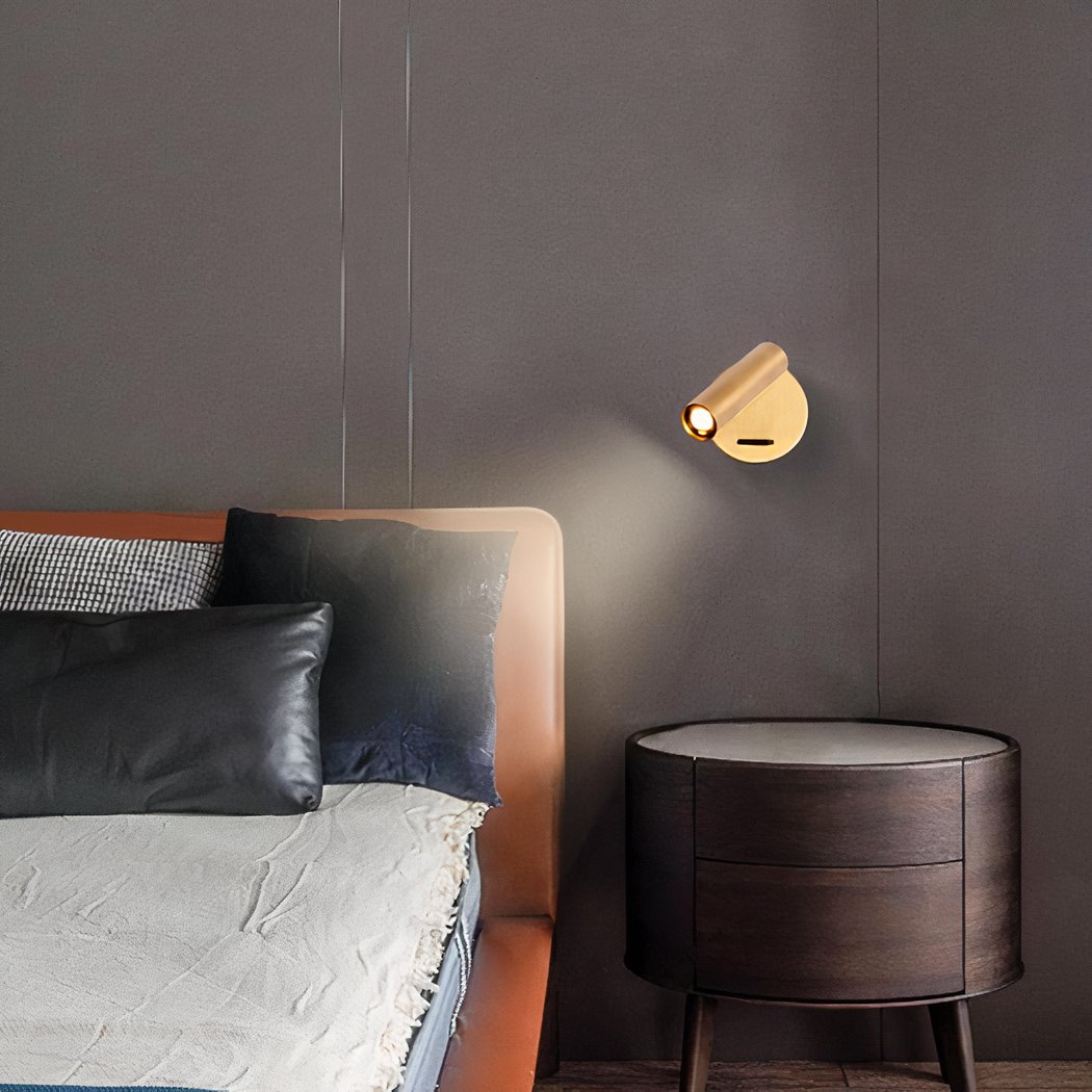
Adjustable brass wall light
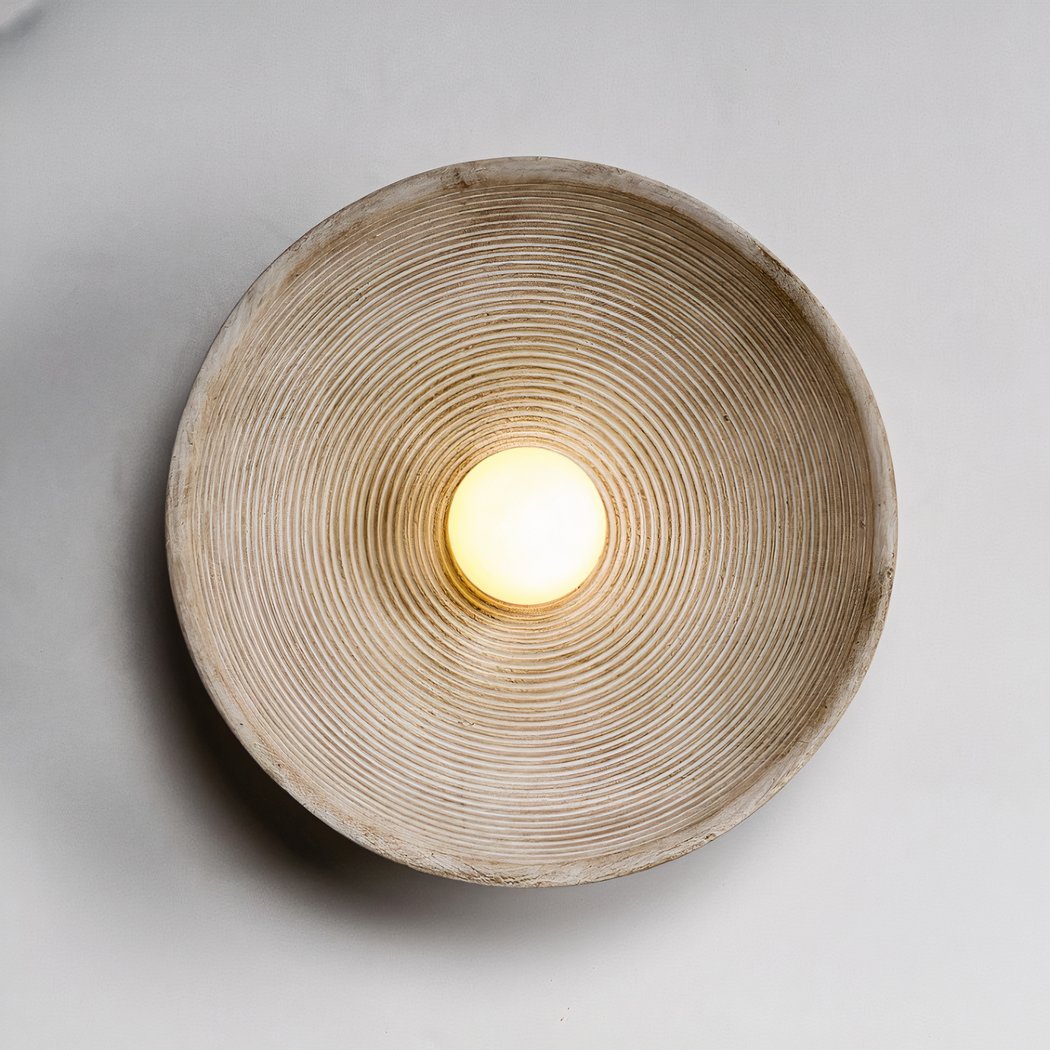
Round textured plaster effect wall light in wabi-sabi style
See also

Can I Use a 60W Bulb in a 40W Lamp? What the Limit Really Protects

Calming Colours: The Palette, and the Evening Light It Cannot Do Without

Colour Rendering Index: What CRI Measures, and the R9 Figure the Box Leaves Out
